Create a custom Gantt chart with the default Power BI Matrix visual and DAX
Earlier I wrote about How to make a Gantt chart with DAX in Power BI.I promised a part 2, and here it is! Read all about how we created a custom Gantt chart using the default Power BI Matrix visual and Dax.
The data model
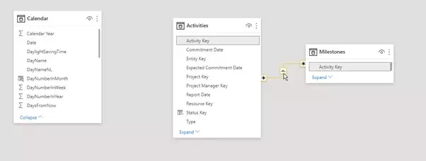
First, let’s take a look at our (simplified) data model to understand what we are working with.
The activity table contains all information about the activities and their start and end dates. There is also a parent column to group the activities into a hierarchy. For all the associated milestones, a separate table is included that show each milestone date on a separate row, with its current status and a key to the activity it belongs to. We added a calculated column to the Activity table that calculated the upcoming due date and called it “Next Assessment Due Date”.
The date table “Calendar” does not have a relationship with any of the other tables, because we do not want this table to influence the filter context of the other table(s). These dates are used in the matrix to:
- Function as a timeline
- Compare the start and end date of the activity with the selected calendar date to define Whether or not the project was active during that time range
- Check if the milestone date is within range of the selected calendar date(s)
The matrix visual
Now let’s get started with the matrix visual.
- Select the matrix
- Drag and drop the fields for your desired hierarchy of project activities on the rows
- Add the date hierarchy from your Calendar table in the column fields
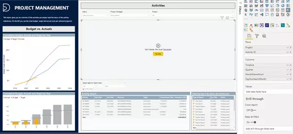
The visual results in an error now, because there is no relationship between the Calendar and Activity table. The DAX measure will create that relationship and resolve the error.
The DAX measure
First, the part of the measure that checked if the activity is (or was) active in the selected period is defined and tested:
VAR MinDate =
    MIN ( 'Calendar'[Date] )
VAR MaxDate =
    MAX ( 'Calendar'[Date] )
RETURN
    CALCULATE (
        DISTINCTCOUNT ( 'Activities'[Activity ID] ),
            ( Activities[Proposed Start Date] <= MinDate
            && Activities[Proposed End Date] > mindate )
            || ( Activities[Proposed Start Date] >= MinDate
            && Activities[Proposed Start Date] <= MaxDate
            && Activities[Proposed End Date] <= MaxDate )
            || ( Activities[Proposed Start Date] >= MinDate
            && Activities[Proposed Start Date] <= MaxDate
            && Activities[Proposed End Date] >= MaxDate )
    )
The result in the matrix shows 1’s for active and blanks for inactive activities. The results are checked by looking at the start and end dates in the activity details table below.
Then, the logic for the milestones was defined. The final chart should visually show the statuses of the milestones with icons, so I pre-coded them:
– IsActive = 1
– NextAssessmentDate = 2
– DueDatePending = 3
– DueDateCompleted = 4
– DueDateCancelled = 5
This results in the following DAX code, where the first measure is transformed in a variable and for all other numeric numbers a new variable is added. The numbers that are returned will reflect the status of the activity or the status of the milestone as written out above.
Is active or has milestone in selected period =
VAR MinDate =
    MIN ( 'Calendar'[Date] )
VAR MaxDate =
    MAX ( 'Calendar'[Date] )
VAR IsActive =
    CALCULATE (
        DISTINCTCOUNT ( 'Activities'[Activity ID] ),
            ( Activities[Proposed Start Date] <= MinDate
            && Activities[Proposed End Date] > mindate )
            || ( Activities[Proposed Start Date] >= MinDate
            && Activities[Proposed Start Date] <= MaxDate
            && Activities[Proposed End Date] <= MaxDate )
            || ( Activities[Proposed Start Date] >= MinDate
            && Activities[Proposed Start Date] <= MaxDate
            && Activities[Proposed End Date] >= MaxDate )
    )
VAR NextAssessmentDate =
    CALCULATE (
        DISTINCTCOUNT ( 'Activities'[Activity ID] ),
Activities[Next Milestone Due Date] >= MinDate
            && Activities[Next Milestone Due Date] <= MaxDate
    )
VAR DueDatePending =
    CALCULATE (
        DISTINCTCOUNT ( 'Milestones'[Key] ),
        Milestones[Due Date] >= MinDate
            && Milestones[Due Date] <= MaxDate
            && OR ( Milestones[Status] = "In progress", Milestones[Status] = "Pending Report" )
    )
VAR DueDateCompleted =
    CALCULATE (
        DISTINCTCOUNT ( 'Milestones'[Key] ),
        Milestones[Due Date] >= MinDate
            && Milestones[Due Date] <= MaxDate
            && Milestones[Status] = "Completed"
    )
VAR DueDateCancelled =
    CALCULATE (
        DISTINCTCOUNT ( 'Milestones'[Key] ),
        Milestones[Due Date] >= MinDate
            && Milestones[Due Date] <= MaxDate
            && Milestones[Status] = "Cancelled"
    )
RETURN
    IF (
        NextAssessmentDate >= 1,
        2,
        IF (
            DueDatePending >= 1,
            3,
            IF ( DueDateCompleted >= 1, 4, IF ( DueDateCancelled >= 1, 5, IsActive ) )
        )
    )
Drag the new measure into the value field of the matrix visual and check the results. The matrix is now showing our numeric code.
The result
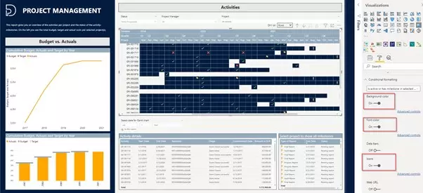
Now conditionally format the numbers to mimic bars over time and visualize the milestones with icons. Use the Background, Font and Icons options to visually inform the report user what the status is of each milestone for any of the activities.
Help needed?
Do you have specific wishes for you Gantt Chart, that Power BI or the custom visuals from the Appsource, do not seem to meet? Let us know, we would love to think along.


